Denis Dyack

Denis Dyack

Founder
1588505801165.png
The new News page is definitely better than the previous ones. It might need some adjustments, though.

For me, the little topic balls at the top don't work. If you click on them, it won't switch the highlights. Clicking on the grey "next" and "previous" button also doesn't work. It does swap the highlight if you let the red bar progress until the end, but you can't switch it yourself.

Also, slightly hovering over the highlight section (basically, the entire screenshot area) is enough to bring the progress bar back to the beginning. I suggest having it pause its progress instead.

The topic selection balls on top of the video are a bit hard to see depending on the image in the background. It might be interesting to make them more solid, instead of transparent, or add a glow or background to them so that they can be more easily seen.

And also:

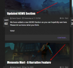
1588506127786.png

I think the font in those news titles need either more spacing between each character, or need not being bold. It is surely a personal take here, but I think it will be hard for some people to read the titles, depending on their monitor and other considerations. The font of the content itself is great, though.

That's it, all I had to say. :)
 
Last edited:
  • Like
Reactions: Denis Dyack
The new News page is definitely better than the previous ones. It might need some adjustments, though.

Thanks! Agreed, it needs some polish.

For me, the little topic balls at the top don't work. If you click on them, it won't switch the highlights. Clicking on the grey "next" and "previous" button also doesn't work. It does swap the highlight if you let the red bar progress until the end, but you can't switch it yourself.

That is really strange - they all seem to work for me. I will have other people take a look.

Also, slightly hovering over the highlight section (basically, the entire screenshot area) is enough to bring the progress bar back to the beginning. I suggest having it pause its progress instead.

Yes, the bar starts to go backwards. That is the intended functionality.

The topic selection balls on top of the video are a bit hard to see depending on the image in the background. It might be interesting to make them more solid, instead of transparent, or add a glow or background to them so that they can be more easily seen.

I will look into where I can adjust that and try.

I think the font in those news titles need either more spacing between each character, or need not being bold. It is surely a personal take here, but I think it will be hard for some people to read the titles, depending on their monitor and other considerations. The font of the content itself is great, though.

Font changed from Impact to Cinzel with a drop shadow. Thanks for the feedback @Golden Xan - this was excellent.
 
  • Happy
Reactions: Golden Xan