Golden Xan
Moderator
Staff member
Mallius Odium
Players Playing Bloodbath Demo
Immemorial
Ageless
OG 2020
Grim Scribe
Magus
Vampire Scholar
Harbinger
- Mar 30, 2019
- 349
- 620
- 138
Hey everyone,
There's this new logo that Deadhaus is using on its social media. I want to get a few votes on what you guys think of this change, overall.
This is what it used to be:
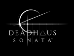
 This is what it is now:
 This is what the new logo looks when smaller:

I personally think this new logo is not badass enough. I like the crown's format better, the cheekbones are more distinct, and the separation from the crown and the head is cool. But, at the same time, the skull reminds me of a toy, the lack of teeth or stylized texture to it makes it seems like some other creature's skull rather a human skull (its teeth looks like horse's teeth, actually), and it looks awful when smaller, or seen from afar.
If you guys at Apocalypse want to bring about a new logo, maybe you could consider icons other than skulls as well. But if you want a skull, I believe you can make one that is more brutal, dark and terrifying than this one, especially with the new direction you've implied going for.
Actually, even better. Why don't you make a few logo variants and show them to us se we can help you guys decide which direction looks more awesome for Deadhaus?
What do you guys think? Any suggestions for them?
There's this new logo that Deadhaus is using on its social media. I want to get a few votes on what you guys think of this change, overall.
This is what it used to be:
I personally think this new logo is not badass enough. I like the crown's format better, the cheekbones are more distinct, and the separation from the crown and the head is cool. But, at the same time, the skull reminds me of a toy, the lack of teeth or stylized texture to it makes it seems like some other creature's skull rather a human skull (its teeth looks like horse's teeth, actually), and it looks awful when smaller, or seen from afar.
If you guys at Apocalypse want to bring about a new logo, maybe you could consider icons other than skulls as well. But if you want a skull, I believe you can make one that is more brutal, dark and terrifying than this one, especially with the new direction you've implied going for.
Actually, even better. Why don't you make a few logo variants and show them to us se we can help you guys decide which direction looks more awesome for Deadhaus?
What do you guys think? Any suggestions for them?
Last edited:


 adds magical-science screaming to favourite sayings